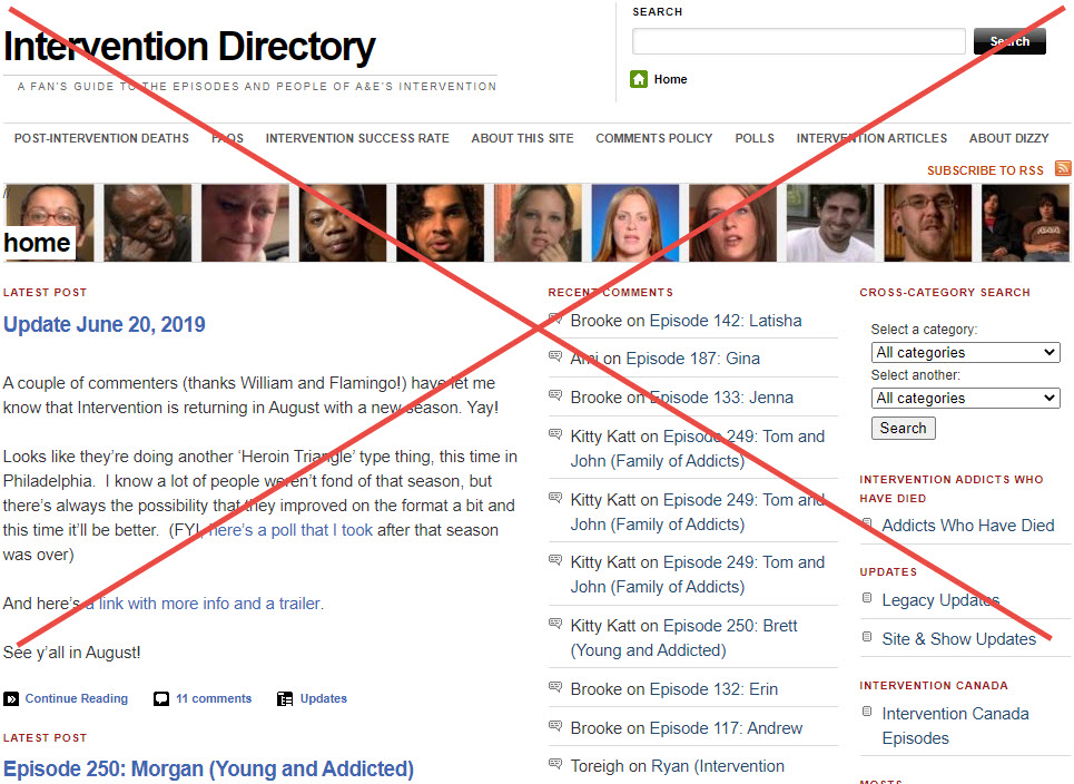
Hey folks, don’t be alarmed! I know this site looks wonky right now but I’m in the middle of re-designing to be more mobile-friendly. It’s had the same design & layout for about 10 years now, it was time for a change anyway. So it’s gonna look funky for a couple of days, but then it’ll be awesome.

Good start! Not sure you noticed the “Did you know” widget text area in the footer still has filler “Lorem ipsum” text. And i would personally make the comments text, the same font as the entry body rather than the narrow font which looks good with titles but is harder to read. Keep up the good work, you are providing an important service.
Thanks, I just started today and there’s a ton of work to do. Still gotta deal with the placeholder text areas. I think the comment font is too small and narrow too, haven’t figured out how to adjust that yet. Thanks for the feedback!
Thank you Dizzy. What you do for us is truly a blessing. You work so hard on something you really don’t have to do. I appreciate everything you do.
I like where it’s going!
I hope we’ll still be able to find most recent comments, always helpful in finding new info.
I just came on here and what a great surprise. I’m looking forward to exploring this new web page. Great job Dizzy! Thank you for doing what you do for us.
Dizzy, I have a question about posting comments. I’m not a computer wiz so maybe I’m doing something wrong. I notice that when people comment and other then respond, why does it come to a point where I can’t respond to that person? The reply button is not there? Example: On Melanie’s story, Laura responded to someone and I wanted to respond to Laura in regards to her comment but there isn’t a reply button for me to respond.
I’m sorry if I’m confusing you.
It’s because there’s a limit to what they call the nesting levels. If there were unlimited levels that indented at each step, the last levels would be so narrow you couldn’t read them. I believe this site is set up to go 2 levels deep, meaning once you hit level 3 you can’t respond to the 2nd level comment but can respond to the first. It is kind of annoying, I know. I’ll see if there’s anything I can do about it though, maybe I could extend by 1 level and if it’s not readable switch it back,